
Which AI is Actually Best for Market Research?
By Yazi Research
- article
- Qualitative Research
- AI
- Artificial Intelligence
- Agile Qualitative Research
- Generative AI
- Mobile Surveys
- Online Surveys
Summarise with AI
We ran an independent, head-to-head test of five large language models across a full research workflow, from raw data to a client-ready report. Here is what we found.
There’s no shortage of opinions about which AI model is best for research, yet there is very little based on actual tests. So we ran one.
The question started between the two of us. We use these tools every day, and kept disagreeing about which model to reach for, and for which job. Not in a vague “AI is amazing” way. But specifically: when I have a quant dataset to analyse, or a thousand open-ended responses to code, or a client report due on Friday, which model should I actually open?
And since we couldn’t find a credible answer anywhere, we built one. We took a real research project, wrote a set of standardised prompts that follow the work a researcher genuinely does, scored every output against a 170-point rubric, and ran five of the biggest models through exactly the same process.
What follows is a full breakdown of what we did, how we did it, what happened, and how you can replicate it yourself. We’ve tried to be as transparent as possible, because a resource like this is only worth anything if you can trust it and test it.
The Leaderboard
If you’re looking for the headline result, here it is: the overall leaderboard before we unpack how we got there.
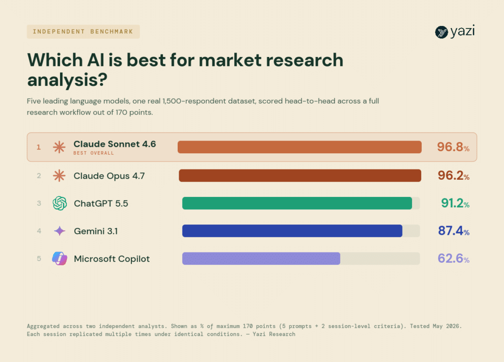
Two Claude models took the top two spots, ChatGPT was a solid third, Gemini fourth, and Microsoft Copilot came last by a wide margin.
The single most important number on that chart is the spread. There are more than 34 points between first and last, making it clear that these tools are not interchangeable, and that the gap is far bigger than the marketing would have you believe. If you have settled on a model out of habit, or because it is the one your company already pays a license for, that choice is worth revisiting.
Now on to how we got there, and why the leaderboard is actually the least interesting part of what we found.
What This Was (And Wasn’t)
A quick word on motivation, because it matters for trust.
This was not commissioned, sponsored, or run on behalf of any of the model providers. We are a research company. We built the test because we needed the answer for our own work, and once we had it, it seemed worth sharing with the industry.
We also wanted to put a few tired arguments to bed. The “AI produces generic rubbish” line, the “it cannot handle a real dataset” line, and the “it is coming for our jobs” line. Rather than argue about those in the abstract, we wanted to test them.
What We Tested
We compared five models using the versions current as of May 2026: Claude Sonnet 4.6, Claude Opus 4.7, ChatGPT 5.5, Gemini 3.1, and Microsoft Copilot.
One note on timing. These models update constantly, so this is a snapshot, not a permanent ranking. The methodology is the durable part. If you rerun it in six months, the scores will move, but the way you run the test should not.
How We Tested
This is the part that matters most, so we have gone into detail.
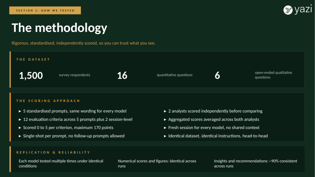
The dataset
We used one real study: a 1,500-respondent survey, anonymised and stripped of anything personally identifiable before any model saw it. It contained 16 quantitative questions and six open-ended qualitative questions. Both of us reviewed the data by hand before testing, so we knew the dataset cold and could judge whether a model was right or just confident.
The five prompts
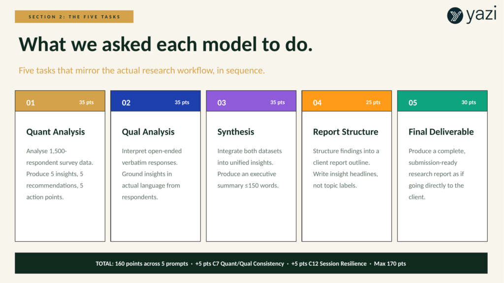
We wrote five standardised prompts that mirror the actual steps a researcher takes between receiving the data and sending the report.
Every model got the same prompts, word for word, in the same order, in a single session.
The scoring
We scored each output against 12 criteria spread across the five prompts, plus two session-level criteria, for a maximum of 170 points. Everything was scored from 0 to 5. The criteria covered the things a research buyer actually cares about: accuracy, output quality, recommendation relevance, action specificity, usability, depth of analysis, how the model handled quant versus qual, dataset size handling, cross-source integration, narrative and headline quality, deliverable completeness, and whether quality held up across the whole session.
A few deliberate choices in the design of the test helped make the results more trustworthy:
- Single-shot, no coaching. We did not follow up, re-prompt, or nudge any model toward a better answer. If the first output was shallow, and that shallow output is what we scored. This tests whether a model already understands what good research analysis looks like, rather than whether we could eventually drag it there. As a researcher choosing a tool, you want the one that doesn’t need babysitting.
- Two independent scorers. We each scored every output on our own, then compared. Where our scores differed by two points or more, we discussed it and agreed on a final number. That keeps any single person’s bias out of the result.
- Fresh session every time. No model carried context between runs, and no model saw another model’s work.
- Replicated for stability. We ran each model multiple times under identical conditions. The numerical scores came out identical across runs, and the insights were about 90% consistent. So this is not a one-off fluke.
If you want the full rubric and the exact prompts, we’re happy to share them as they’re written to be copied and reused.
The Results, Task by Task
The leaderboard is an average. The more useful view is how each model performed on each task, because the shape tells you where the real differences sit.
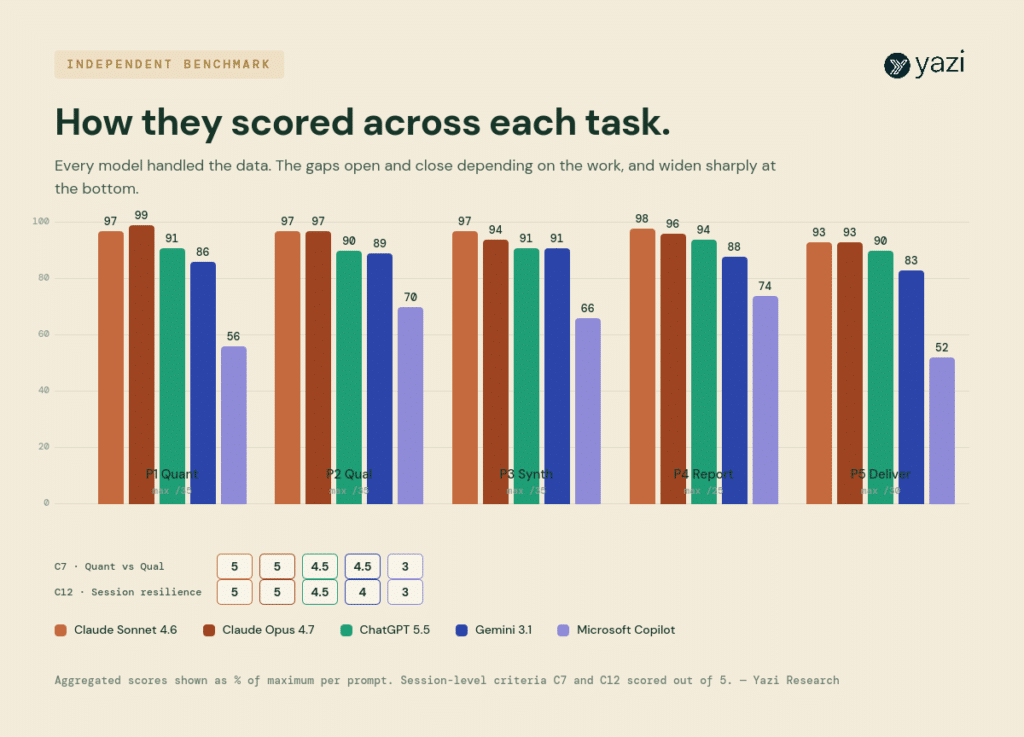
The overall ranking holds across almost every task, but the gaps open and close depending on the work. Here’s what stood out on each prompt. (The full per-criterion scorecards are in the appendix at the end.)
Prompt 1, quantitative analysis. The clearest separator was sub-group analysis. The top three models automatically cut the data by tenure, location, and revenue band without being asked. Gemini stopped at top-line aggregation. Copilot didn’t attempt sub-groups at all and leaned on approximate ranges where exact figures were available. This is the “AI cannot do X” problem in miniature. The capability was clearly there in the top models. The weaker ones simply didn’t reach for it. Same data, same prompt, very different work. It’s worth noting that Opus posted the single highest score of the entire test on this prompt.
Prompt 2, qualitative analysis. The interesting split was about voice. Sonnet and ChatGPT preserved the actual respondent voice, grammar quirks, and all. Opus and Gemini polished the verbatims into smoother prose, which reads better but quietly loses authenticity. That’s a preference call rather than a quality gap, but in qualitative work, the rawness is often the point. Opus surfaced cross-corpus patterns that no other model found. Copilot produced theme labels that could have been written from the brief alone.
Prompt 3, synthesis. Every model managed to integrate the quant and qual, so the technique itself is no longer a differentiator. What separated them was depth. The top models surfaced genuine contradictions and alignments between the two data sources. Copilot stayed at lighter, more descriptive integration. This is also the prompt where Opus slipped slightly on accuracy, which is most of the reason Sonnet edged it overall.
Prompt 4, reporting structure. The closest scores of the whole test, with less than three points separating the top four models. The recurring slip across the entire panel was defaulting to topic labels instead of insight headlines, even though the prompt contained a working example of exactly what we wanted. Even the best models did it at least once. A small but real reminder that the model will take the easy path unless you hold it to the standard.
Prompt 5, final deliverable. This is the diagnostic prompt, the one where sessions either hold together or fall apart. The top models introduced genuinely new analytical content here. The mid-tier consolidated competently. The weakest model rehashed earlier outputs and reverted to a generic template that did not even name the commissioning client. One honest caveat, because it affects real use, is that we asked for a Word document. Only ChatGPT produced one with proper tables. Gemini and Copilot could not produce a Word file at all, so you would have to copy and paste. We held the standardised prompt rather than working around this, but it’s the kind of practical detail that matters when you are delivering to a client.
Beyond the Leaderboard
If you take nothing else from this, take these six.
- Comprehension is solved. All five models understood the data. The bottleneck is no longer whether the model can read your dataset.
- Reframing was the real differentiator. The top tier turned findings into strategic positions. The rest described what was in the data, and that gap is where the human judgement lives.
- Accuracy alone did not win. ChatGPT had the cleanest numbers of the group and still finished third. Being correct is necessary but not sufficient.
- Session resilience varied dramatically. The best models held quality from the first prompt to the last. The weaker ones drifted as the session went on.
- The final report exposes the earlier analysis. Weak thinking upstream becomes obvious by the time you ask for the full deliverable.
- Two of the top three came from the same lab. Anthropic took first and second.
So Which One Should You Use?
There’s no single answer, because the top three are genuinely close and each has a personality. Based on the results, here’s how we’d use each one.
- Claude Sonnet 4.6 for a polished, senior-client narrative. Pros are strategic reframes, real respondent voice, and recommendations that connect, but watch that it sometimes slips word counts.
- Claude Opus 4.7 for deep analytical breadth and segmentation. Pros are automatic sub-group cuts, sharp headlines, and that it surfaces hidden patterns, but it defaults to long and dense.
- ChatGPT 5.5 for accuracy-critical or fact-checked work. Brief-perfect and consultancy-ready, the cleanest quant accuracy of the group. But it’s more descriptive than strategic.
- Gemini 3.1 for ideation and sharp single insights. It’s lean and high-density, but there are no default sub-groups, and it fades a little by the final deliverable.
- Microsoft Copilot for a quick exploratory first pass only. It’s consistent in voice, but approximate rather than exact, and it lost the client framing.
A note on Sonnet versus Opus
We get asked this question most, so here’s the honest read. Sonnet versus Opus was effectively a tie. 96.8 against 96.2 is about a single point on a 170-point scale. Opus was arguably the deeper analyst of the two: it had the highest single score of the whole test on the quant prompt and caught patterns in the verbatims that nothing else did. Where Sonnet won was accuracy consistency. It was tighter on the raw numbers across almost every prompt, and the gap was clearest on the synthesis step, where Opus slipped slightly while Sonnet held. In research, a wrong figure costs you more than a slightly less deep insight. That’s what tipped it. Opus for depth, and Sonnet for a reliable, client-ready output, is a fair way to split them.
What This Actually Saves You
The case for adoption is easier to make in hours than in theory.
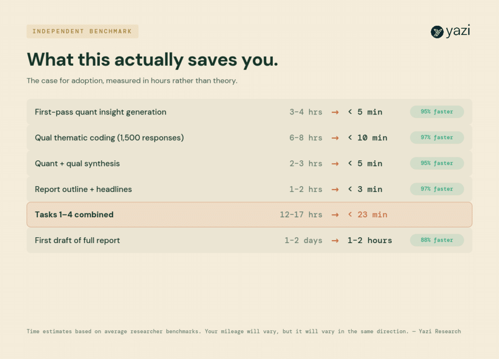
The important shift is where the time-saving now sits. For most of us, the unlock is no longer in finding the insight. It’s in producing the output: the drafting, the chart-making, the slide-building. That’s the part these tools have quietly closed the gap on in the last year. Your mileage will vary, but it will vary in the same direction.
What’s Changed
If you tried these tools in 2023 and walked away unimpressed, that was a reasonable reaction at the time. But three things have changed since.
One, context windows went from a few thousand tokens to over a million, so an entire dataset now fits in a single session. Two, hallucinations dropped sharply, especially inside a tight workflow, with outputs moving from fabricated sources to verifiable ones. And the outputs caught up: a year ago, you couldn’t get a usable report or deck out of these models, and now you can. That last one is the breakthrough that moved these tools from interesting to genuinely useful, because the bottleneck for researchers was never noticing the insight; it was producing the artefact.
The pace isn’t slowing. Every major research consultancy is already experimenting with these tools internally. The choice is no longer whether to use them, but rather how deeply and how fast.
Try It Yourself This Week
The best way to trust any of this is to test it on your own data. None of these takes more than ten minutes, and you don’t need any setup beyond the chat window. Simply follow these steps.
- Paste in a quant table. Copy 10 to 20 rows of survey data into any top model and ask: “You are a senior market research analyst. What are the five most interesting patterns in this data?”
- Code your verbatims. Paste 20 to 30 open-ended responses and ask: “What are the five dominant themes in these responses? For each theme, give me two supporting quotes.”
- Draft an executive summary. Paste your key findings as bullets and ask: “Write a 150-word executive summary for a client. Lead with the most critical finding and end with the single most important action.”
Take 15 minutes one day next week, pick one, and use whatever dataset is already on your desk. That is how this stops being a debate and becomes part of your toolkit.
The Bottom Line
The headline that AI is coming for research jobs misses what the data actually shows. These models do the heavy lifting on production, but they still need someone who knows what good looks like to steer them. The better you are at the craft, the better your instructions, and the better the result.
The researchers who learn to wield these tools well will do better work, deliver faster, and free up more of their time for the thinking that only humans can do. If anything, this is the moment the most experienced researchers should be pulling ahead.
These tools aren’t just good enough any more. They are fit for everyday use.
We ran this study independently at Yazi Research. If you would like the full scoring rubric, the exact prompts, or the per-criterion breakdown, get in touch, and we’ll share them. The whole test was run inside the standard chat interface, with no API or custom tooling, specifically so that anyone in the industry can replicate it.