The Case for Better UX in Research Technology
By AddMaple
- article
- User Experience (UX) Research
- AI
- Dashboards
- Data Analytics
- Data Visualisation
- NLP (Natural Language Processing)
- Qual-Quant Hybrid
- Reporting
- Statistical Analysis
- Survey Analysis
- Survey Research
- Text Analytics
- Verbatim Response Coding
Summarise with AI

I come from user research. That is where I started, and it is the lens through which I still look at everything. So it probably will not surprise you that one of the things I find most frustrating about the research and analytics technology space is the state of its user interfaces.
This is not a new problem, but I think it is getting more complicated, and I do not see enough people talking about it.
Learn more by watching or listening to Ange on the Founders and Leaders Series podcast here:
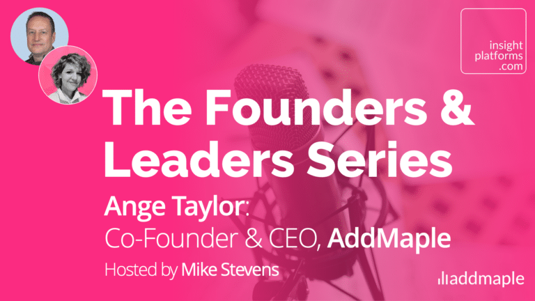
Episode 11: Ange Taylor, Founder & CEO, AddMaple
A Legacy of Difficult Design
The research industry has a long-standing tradition of building tools with very rich functionality and very poor interfaces. SPSS is the obvious example, incredibly powerful analytics capabilities wrapped in an interface that was, to put it charitably, incredibly challenging to use. That pattern has repeated itself across a lot of the tools that market researchers and analysts have relied on for decades.
The frustration I had early in my career was not really about the analysis itself. It was about the time it took. By the time I had done the work in SPSS, produced the chart, and delivered the insight, the decision had often already been made. I felt like I was constantly chasing decisions. The tools were technically capable, but the experience of using them was an uphill battle.
That gap between capability and usability is something I think the industry has accepted as normal. It should not be normal. A powerful but unusable tool is not actually useful to the people who need it. And in the context of insight work – where the whole point is to get findings to decision-makers quickly and clearly – a slow, frustrating interface is not just an inconvenience, it is a problem that affects the quality and timeliness of the work.
The Rise of the Chat Interface
The recent shift towards AI chat interfaces has added a new dimension to this problem. I look at more and more tools, and see the same pattern: there is an AI interface where you can type questions and get answers, and then there is a separate traditional interface where you do the actual analysis. The two are not connected.
I understand why this happens. Adding a conversational AI layer is relatively fast to build. Integrating it with an existing analytical interface is much harder. The consequence of not doing that integration properly is significant.
If the AI generates a chart for you and you cannot edit or relabel it, cannot switch the rows and columns, cannot make basic adjustments (…), then you either use exactly what it gives you or you go back and forth in the prompt trying to get something closer to what you need. That is not a workflow, it’s a workaround.
The deeper issue is that a disconnected AI interface creates a split experience. You have two separate modes of working that do not talk to each other. That might be fine in some industries, but in research and analytics, where people need to interrogate data, present findings to stakeholders, and defend their conclusions, a fragmented tool creates real friction.
What Good Design Actually Makes Possible
I don’t believe the answer is to abandon the traditional analytical interface in favour of pure AI-driven interaction. But neither is it to keep the two separate. The answer is to bring them together, and properly.
What I mean is an experience in which the AI can operate within the user interface. Where you can ask a question in natural language and the tool responds by doing something in the interface, like filtering the data, running an analysis, surfacing a pattern (…), so you can then interact with that result directly. You can edit the chart, adjust the filter, and go deeper into a particular segment. It is one joined-up experience, not two parallel ones.
That kind of integration is technically harder. But it is what good research tools should be working towards. The value of a clean, intuitive interface – one that lets people explore data visually, click to filter, and see the whole picture shift – is not talked about enough. Certainly not compared with the amount of conversation that goes into AI features and funding rounds.
Some businesses have built themselves into significant organisations primarily on the strength of their user interface. The focus on the experience is what drove that. Caring about design is not shallow, it’s essential.
Why UX Matters More in our Industry, Not Less
There is one more thing worth saying. In our industry specifically, the quality of the interface matters a great deal because of what the work is actually for. Research and insights exist to help businesses make better decisions. The people doing that work need to be able to move quickly, communicate clearly, and present findings with confidence.
A tool that makes that harder through a clunky interface, a disconnected AI layer, or an inability to edit and adapt outputs undermines the value of the work. And in an environment where insight teams are already under pressure to demonstrate their contribution to the business, that is a problem worth taking seriously.
I am not anti-AI. Far from it. But I do think the current trend of building AI-first products without equal investment in the interface is a mistake. UX is not a “nice-to-have” feature that comes after the clever stuff. It is what makes the clever stuff usable. And in our industry, usable is what matters.
Learn more by watching or listening to Ange on the Founders and Leaders Series podcast here: